
Affect for effect
Why to use emotion in data communication

In the 1990s, neuroscientist Antonio Damasio treated a patient called Elliot. After surgery to remove a brain tumour, Elliot’s intelligence was fully intact: he could reason, argue, solve complex problems. But his life was falling apart. He couldn’t hold a job, lost his savings, went through two divorces. The reason? The surgery had stripped him of the ability to feel emotion. And without it, he couldn’t make even the simplest decisions. Choosing a pen colour became a 10-minute ordeal.
Damasio’s research into why this happened changed how we think about the brain: emotion isn’t the obstacle to good decisions. It’s a prerequisite.
Our brain processes information through two systems: affect (emotion) and cognition (reasoning). The affective system makes judgements—it tells you whether something is good or bad. The cognitive system interprets and makes sense of things. The two work together, and neither is sufficient on its own.
What does this have to do with data storytelling though? A lot, actually. If you want your audience to make decisions based on data, you cannot take emotion out of the equation—whether you’re sharing a chart internally or running an external communications campaign.
Can dashboards be emotional?
Let’s start with the most improbable place for the affect system to hide in. When you think about emotion in data design, dashboards probably aren’t what comes to mind. They’re grids of charts, often updated automatically, glanced at once per day or week. But they’re not doomed to feel lifeless.
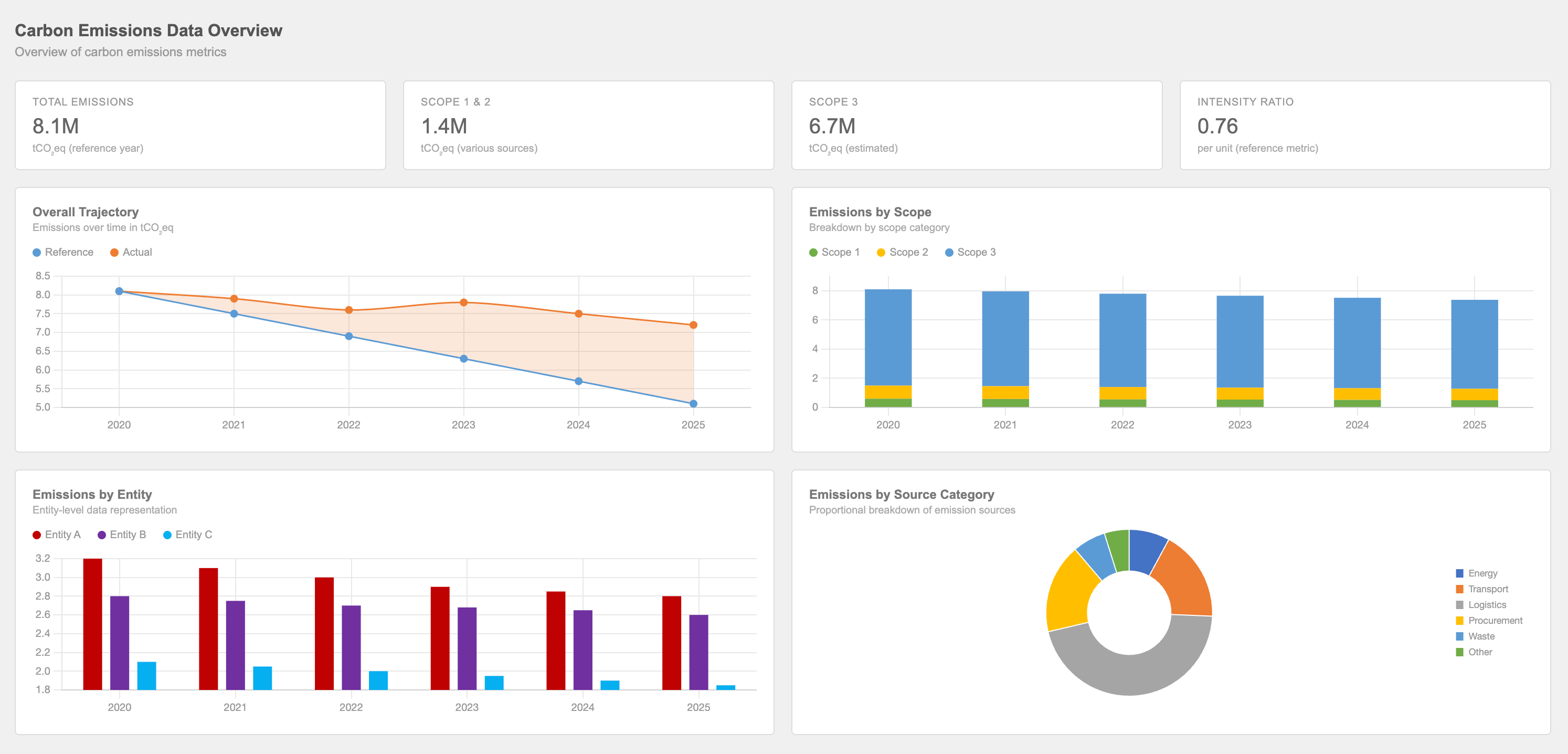
Take this generic carbon emissions dashboard. What do you feel looking at it? Probably nothing. It’s accurate, sure, but it doesn’t make you feel anything.
Now, how about this one?
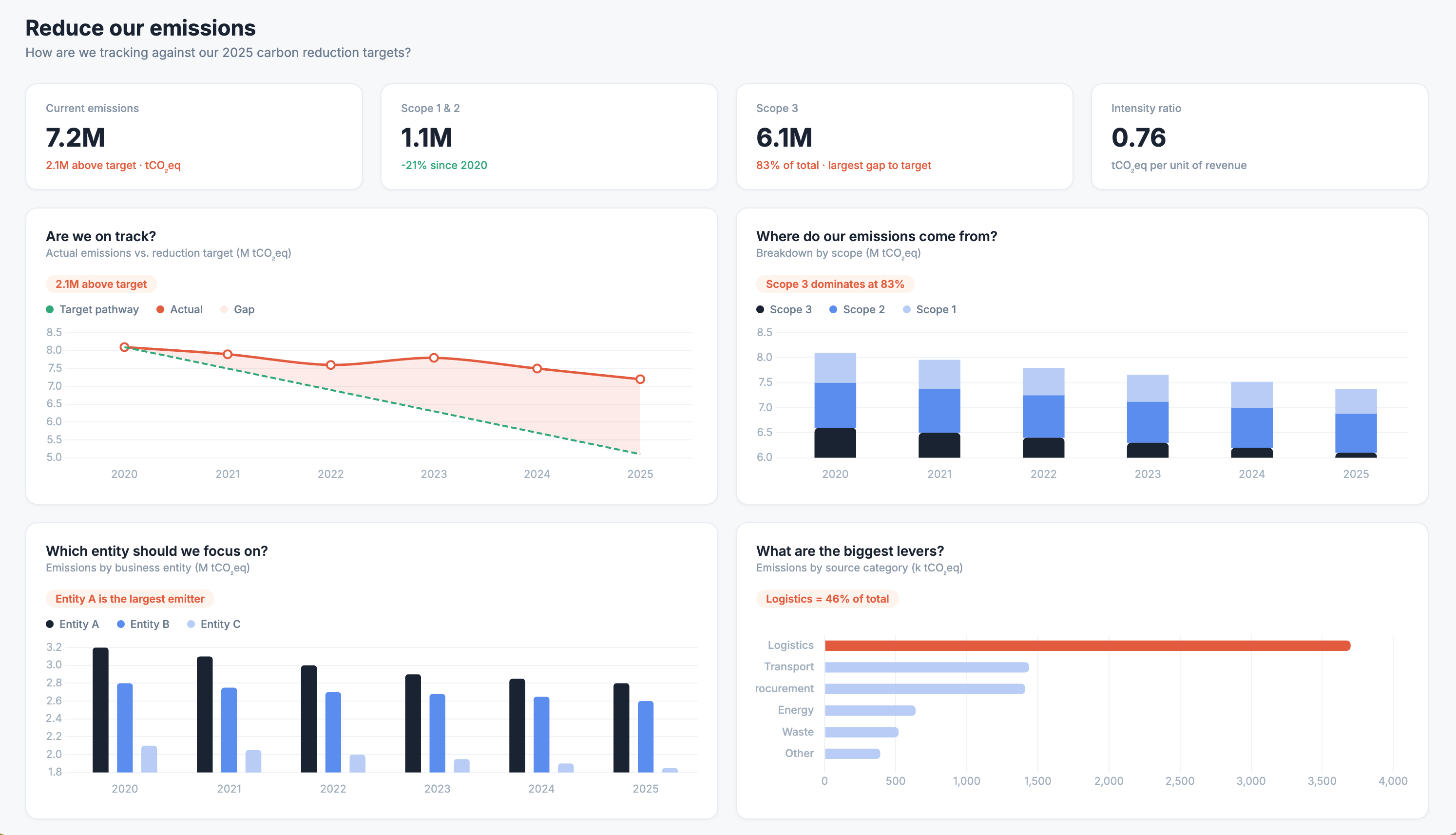
What changed? The titles now ask questions: “Are we on track?”, “Which entity should we focus on?” Colour is used with meaning, like red flags where targets are missed. And each chart carries a short annotation underneath the headline.
That’s all it takes. You are now reacting to the numbers. What you feel may vary: maybe it’s worry, maybe it’s relief. But you do feel something, and that is what will push you to act.
The underrated emotion for presentations
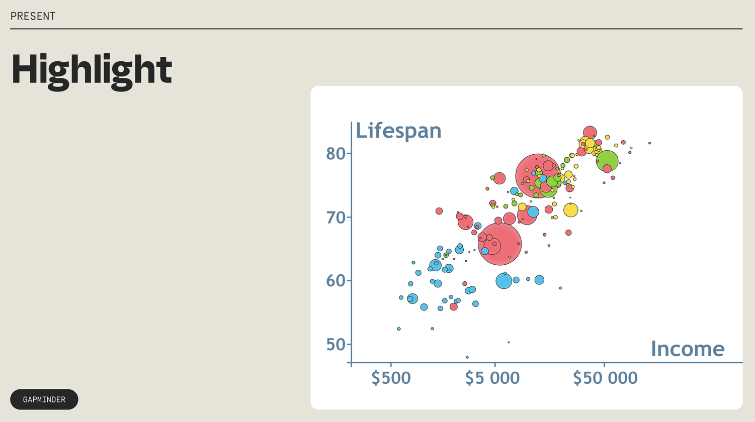
You have certainly made a slide deck (or 473 of them) in your career. And I'd be willing to bet that for many of those, the audience's reaction was… polite attention. But when you present data, you have the most powerful emotion at your disposal: surprise. Think about it. A chart that appears all at once is information. A chart that builds, element by element, is a story. Your audience doesn’t know what’s coming next. They’re leaning to find out more.
You can add surprise to your presentations in a couple of ways. Highlight elements one by one, like in this Gapminder example.
Or go further and actually reveal the data piece by piece.
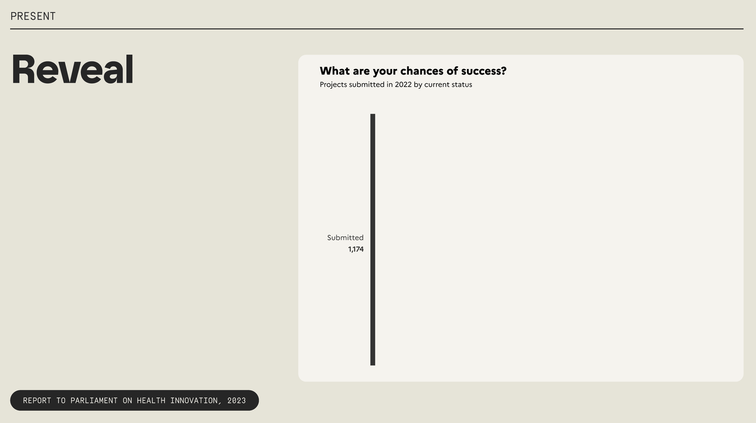
The difference is subtle in theory but powerful in practice—you’re guiding your audience through data discovery.
When (too much) emotion is already there
So far, we’ve been adding emotion where there isn’t enough of it. But what about the opposite situation? What do you do when the topic is already so emotionally charged that the audience risks shutting down?
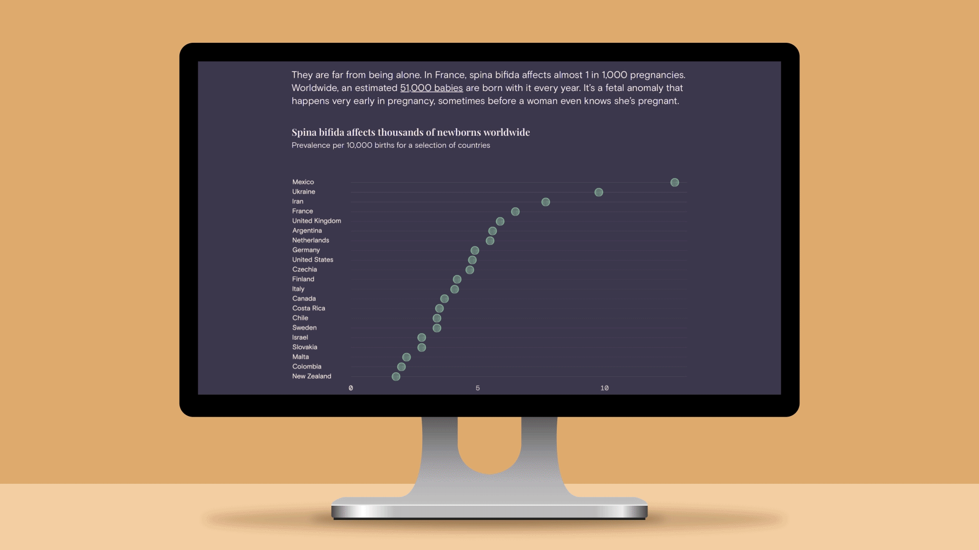
Last year, we started a pro bono initiative at Parabole: data storytelling pieces on topics that matter but don’t get enough attention. The first one we published was about spina bifida, one of the most common fetal anomalies that can turn your life upside down in 2 minutes. And it was incredibly personal to me.
The instinct might be to lean into the emotion. But since the story already carried so much sadness, we needed data to steady it. So we alternated between the personal narrative, illustrations and charts that make the story real, trustworthy and hopeful.
The goal is the same: find the balance between what your audience feels and what they understand. One without the other won’t move anyone to act.

If we believe that we need our stories to make an audience feel something so that they do something, then we need to become students of emotional intelligence. —Jeremy Connell-Waite
Next time you design or present with data, start with the emotion angle and see how it changes the outcome.
Thanks for reading!
See you next month,
—Evelina