Accessibility, design, and storytelling
Three trends that will keep shaping the field of data visualisation in 2023
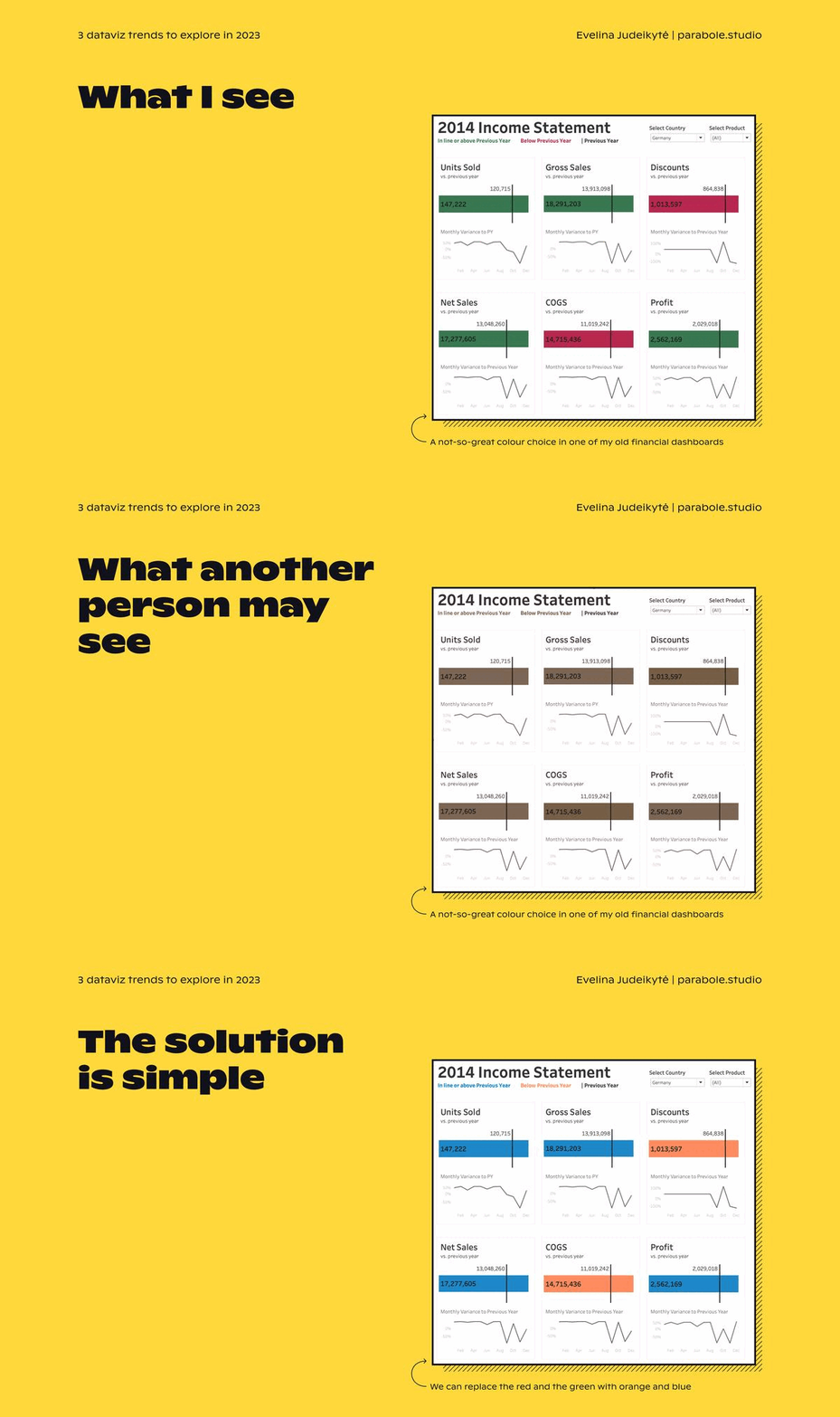
A few years ago, I joined an HR-tech startup to work on their data team. On my second day, I was asked to update an existing dashboard. The premise of the dashboard was straightforward — to track the timeliness of employment contracts. In a few stacked bar charts, the proportion of the paperwork prepared late was coloured in red, and the remainder of it in green. I alerted my manager that the combination of red and green wasn’t an optimal colour choice, but he assured me that the key person looking at the charts — the VP of the company — was fine with it.
As it was my first week at the job, I didn’t want to push back too much just yet. So I went along with this explanation. Later that day, I met the VP in question to present the updated dashboard. After barely seeing the first graph, he stopped me and said: Sorry to interrupt, but I just wanted to let you know that I’ve got colour blindness. All the categories on the screen look the same to me…
If you’re reading this and thinking well duh, that’s dataviz 101, you’re right. It has become common knowledge that certain colour choices exclude a part of the population. We know this because accessibility is becoming a strong pillar of the data design field, and it pushes us to do better. But accessibility is only one of three positive trends I believe will shape the way we communicate data in 2023 and beyond. So in this New Year edition of The Plot, let’s look at them in more detail.
Accessibility
Colour-blindness is often the entry point for accessibility in data designs. It’s a straightforward issue to grasp and its solutions are simple. But that’s only the first step towards making dataviz more inclusive. In the dashboard example below, we observe at least two additional improvements that could be made after the red and green issue is solved — increased text size and colour contrast.
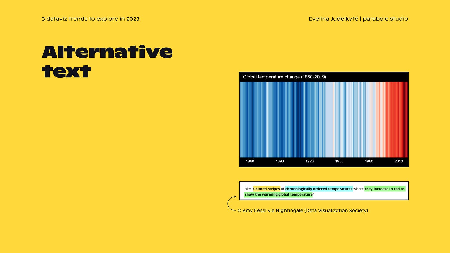
When we optimise the colours and the text in our designs, we help include audience members with vision deficiencies (which any one of us can experience at some point in life, really). To include those who can see very little or not at all, we know we can add alternative, or alt, text. Alt text is a description that explains images for people who use screen readers to navigate the internet.
These are just a few examples of how the field of data visualisation is slowly moving towards more accessible solutions. I’m convinced that these practices will expand even more in 2023. Why is it important to you? Because the more accessible your work is, the more people will be able to see it and understand it, which in turn will increase your impact. Isn’t that what we all want?
Design
In my experience, aesthetics is an often misunderstood concept. If I could get a penny every time I hear “oh, so your job is to make things look pretty”, I’d be rich. Yes, good designers make beautiful things. But beauty, at least in my line of work, is the means, not the goal. The goal of good design is to communicate a message, to engage, and to encourage exploration.
To communicate a message, the design needs to, first of all, be clear. One of my favourite illustrations of this idea are the makeover GIFs by DarkHorse Analytics. They take a not-so-optimal chart design and improve it with quite simple yet effective design practices. Take a look at the salvaging the pie example below.

Wouldn’t you much rather explore the final version of the chart? Design helps you get the message across. It can also help you engage the audience. Today, we see graphs all the time, and sometimes we need to innovate so that people are seduced to interact with ours. The journalists at the French media Le Monde did that with their Twitterverse article.

When you first click on the link, you see an abstract shape that is a little odd to decipher. It looks nothing like bars or lines that we’re used to. But that’s exactly the point — to surprise, to encourage exploration. You scroll and zoom because you’re curious, and when you do so, you see names, connections and data that tell a story.
Designing for more clarity and engagement is the second trend I think we’ll keep pushing forward this year. Designers and journalists have been working on this for some time now, but I also observe it among my clients who are less versed in data visualisation. On top of learning dataviz tools, they’re now looking to improve the aesthetics of their charts, dashboards and infographics for more impact. Beautiful, isn’t it!
Storytelling
If this is not your first time reading this newsletter, you already know that storytelling is very near and dear to my heart. And I’m thrilled to observe that chart makers lean towards more and more storytelling. Why is that? I think that by now we’ve gotten quite comfortable with data collection and manipulation, as well as communicating with simple charts. What we still often miss though is the human factor. Something that can bring data to life. Something that can make it feel relevant. This is where storytelling comes in.

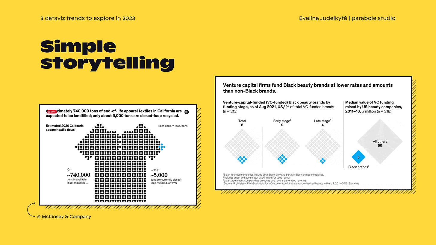
To tell stories with data, you don’t always need to publish long-form visualisations or scrollytelling pieces. As soon as you choose an insight to communicate, an AHA moment to share, you start creating a story. The simplest way to do it is to steer the audience’s attention with an editorialised title and some highlight elements, like in the McKinsey examples above.
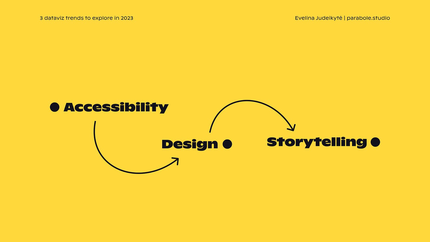
So let’s recap. Making dataviz accessible helps us reach a broader audience. Designing well reinforces the message and engages the reader. Adding a touch of storytelling makes the designs relevant and maintains the audience’s attention throughout the whole piece. These three trends will not only be fun to explore further in 2023, but they will also empower us to create better and more impactful visualisations.
Do you agree with the above? Would you add anything? Do share in the comments!
As ever, thanks so much for reading The Plot.
See you next week!
— Evelina
Resource corner
Good charts by Scott Berinato. I’ve just finished this book and really enjoyed it — the author has a unique way of explaining dataviz and storytelling basics.
Data + Love podcast episode. Zach invited to have a chat with him this week, and we ended up talking tone, engagement and responsibility in dataviz.
If you speak French, you can listen to the talk I gave on the three dataviz trends for 2023 at the French government’s Data Days event (video of Nov 23, starting at 01:14:30).
Did you know that I run my own data design studio called Parabole? 📡 If you like The Plot and my approach to data storytelling, do reach out to us for design projects, trainings or consulting services. Just shoot me an email at evelina@parabole.studio and we’ll get things going! See you soon :)


Really like your point about design being how you guide attention and experience, not necessarily how you “make it pretty.” Thank you, enjoyed this!
HELP!!!! I'm looking for the best infographics. See my example and you will understand the populations, economic status and life expectancies of all the countries of the earth in just a few minutes. Any help finding group or other places to watch "the best infographics" greatly appreciated. Start at 2:46 to skip the intro's. Even key search terms sincerely appreciated.
https://youtu.be/hVimVzgtD6w